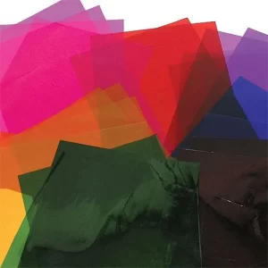
Pigments
Type
Generative art
Tools
GLSL/WebGL
Date
August 2021
Edition of 1024 tokens of on-chain generative art, released on Artblocks curated collection, as NFTs.
You can order prints of these pieces in high quality paper or premium sublimated metal. You can also collect the original tokens on secondary marketplaces like: OpenSea and Sansa.
About the project
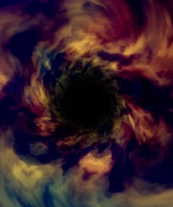
Pigments is a generative art project created as an edition of 1024 mintable NFTs. It was selected by the pioneering crypto-art platform Artblocks for its curated collection and is hosted on the blockchain via its site.
The project is the result of deliberate and conscious research of colour. Its main driving forces are several distortion techniques on the canvas that allows for dynamic structures to emerge.
At its core, the algorithm exploits different flavours of noise and randomness, which are essential tools in the arsenal of a creative coder. The algorithm is capable of creating configurations that resemble certain substances and structures found in nature. The pieces are meant as evocative abstractions of such entities.
What follows is an article where I describe the process of sketching and programming Pigments. I offer insights into the compositions as well as information that may be interesting for collectors. I also roughly explain how the algorithm works while diving into specifics about aesthetic decisions and sketches that were not ultimately selected for the final release. Certain aspects of the pieces require some understanding on a technical level but do not worry; I try to keep things as intuitive and accessible as possible.
Let us begin then by getting familiar with some concepts employed in the creation of the pieces.
The canvas
In digital art, just like in the analogue world, we have paint and a canvas, in the form of a screen with pixels. These are tiny little tiles arranged as a grid that accept different values to define colour. The screen is essentially a map that we can use to address a specific location with an arbitrary coordinate system.
For example, to address the very first pixel in the bottom left of your screen, you may say that it lives in the location (0, 0). To define the pixel on the top right, you may say it is in position (width, height). That is a crucial concept because it means that we can access any pixel on the screen via a computer instruction, just by using its address.
As creators, we use the default coordinates most of the time, just like a painter chooses some canvas of a given dimension and proceeds to paint on it. But, what if your attention is not on the paint but on the canvas itself when you start creating? Imagine the painter twisting, bending and altering the canvas in various ways before even applying any colour. That is, in principle, what is going on under the hood with Pigments and what creates all its properties.
Warping space
Let us try to reinforce that idea with a practical example. Imagine that we want to draw an intricate pattern on a piece of paper. We could take a pencil and draw lines in a semi-random motion. Depending on how complex we want the design to be, that can be effortless or very time-consuming. If the latter, the major drawback of this approach is that it becomes very tedious to plan the trajectories that we want to follow after doing it a couple of times.
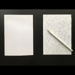
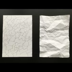
An alternative could be to take the piece of paper, crumple it and flatten it so that the resulting ridges act as guides for us to draw our lines. With this approach, we do not need to think much, given that the intricate pattern is a result of the paper itself, not us. On every subsequent crumpling, we get a new design for free. All we have to do is follow the ridges! Which of these approaches seems more efficient?
It is vastly easier to manipulate our canvas, distorting it in many ways, than designing complex strokes to create patterns deliberately. You may try this yourself at home by measuring how long it takes you to produce a random design with the manual approach. Then try and see how long it takes you to take a piece of paper, manipulate it and observe the resulting ridges. It is not only about speed either. Which one do you think is more visually appealing on the first try?
Domain warping
The core technique employed in Pigments is a type of spatial modulation commonly known as domain warping. It is widely used in computer graphics, mainly to generate maps and textures for materials since it has organic-looking results. The principle is remarkably simple and, believe it or not, has already been explained with our real-world example above. Essentially, it involves the deformation of a coordinate space using some arbitrary functions, which is very much like cramping our piece of paper and producing ridges.
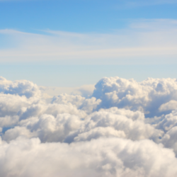
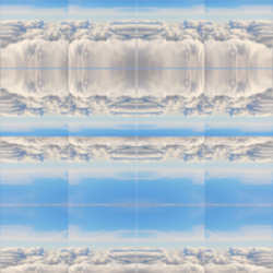
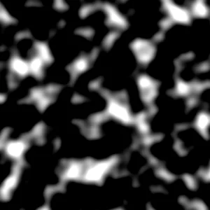
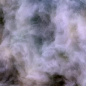
You can see, for example, what happens if I take an image of some clouds and warp their coordinates by using \(\cos(x)\) and \(\sin(y)\) functions for each pixel coordinate.
Domain warping consists of this simple idea but using a special function called Fractional Brownian Motion (FBM) to sample the points \(x\) and \(y\) in our coordinate system.
If you want to know more about this technique, you can refer to this excellent article by Inigo Quilez.
Fractional Brownian Motion
To understand this function intuitively, imagine a tense string of some musical instrument that produces some arbitrary pitch (or frequency). Now, imagine that you touch the middle of the string while it is vibrating. That creates the same pitch but one octave higher and with softer volume. If you press the quarter and play it even more delicately you get the same pitch again but two octaves higher than the original, with very soft volume. We thus create a sequence of self-similar values at different scales by doubling the frequency and halving the volume on each step.
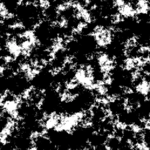
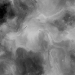
The FBM function operates similarly, but instead of dealing with sound, it gives us a single noise value that can be used to colour our pixels. The generated noise can be very smooth-like visually, depending on the number of “octaves” used. The higher the octaves, the more detailed the result, but also the heavier the computation.
You can see here on the right the result of an FBM function with two and six octaves. As you can tell, they are black and white images with a peculiar distribution, perhaps reminiscent of the aerial view of land, or the structure of rock formations.
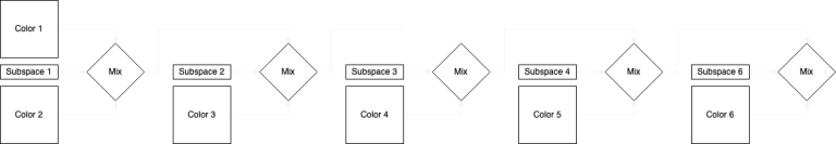
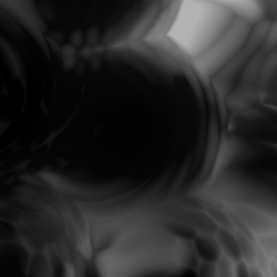
In Pigments, I implemented a more elaborate version of domain warping. Different types of FBM functions are applied independently per axis on multiple levels. In this manner, each level acts as a separate “subspace”, which is then combined with others to create a final “superspace”. There are five such subspaces, stacked in the outcome for any given mint of Pigments, which look like this under the hood:
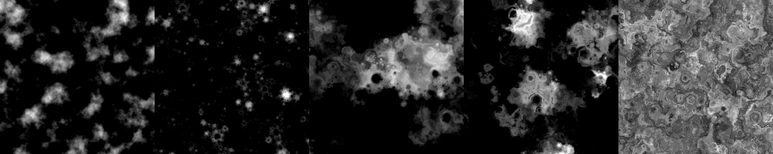
Each subspace uses a unique “flavour” of a noise function. When these functions are stacked and blended, they act as maps for different combinations of colour.
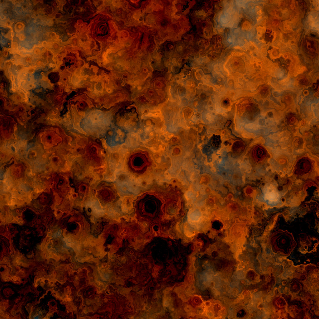
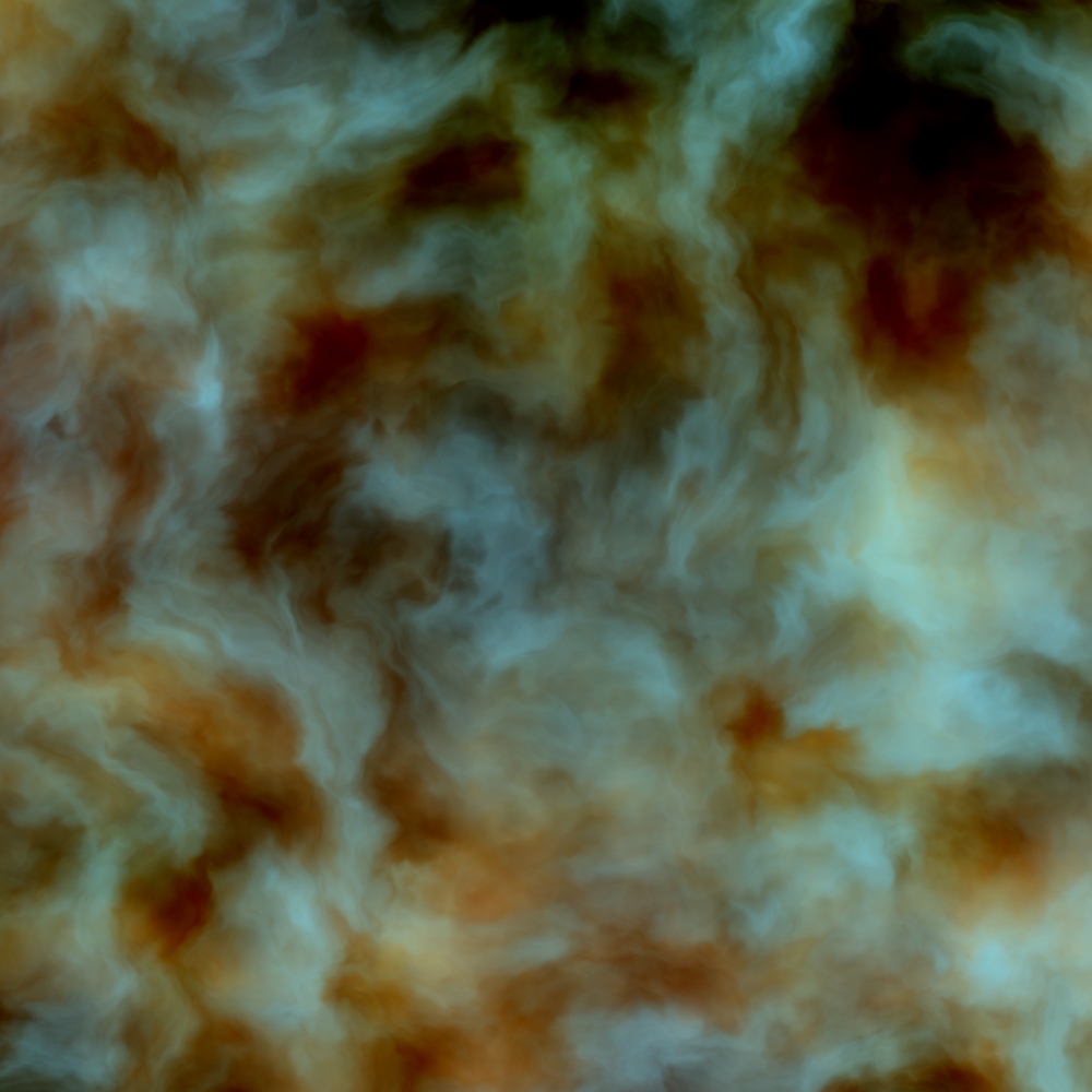
You can see here on the right a Pigment created by such procedure. Notice how properties from the underlying subspaces are visible in the final structure and how their mixture creates an illusion of depth.
One of my goals with these pieces was to transcend a two-dimensional graphical look. I wanted to create something akin to oil on canvas, which has all sorts of little details from the paint itself when looking up close.
Notice that the colour in this image is distributed according to how much white the dominant maps have. That is no coincidence since the maps blend with one another using their grayscale values.
Map one is mixed with map two. The result is mixed with map three, and so on until, by the time we reach map five, the incoming colour set is a composite of all previous stages.
Palettes
The project is all about mixing colours and imagining substances. However, It started through research to create more complex maps that could be later used for something else. For instance, materials for 3D objects or height maps.
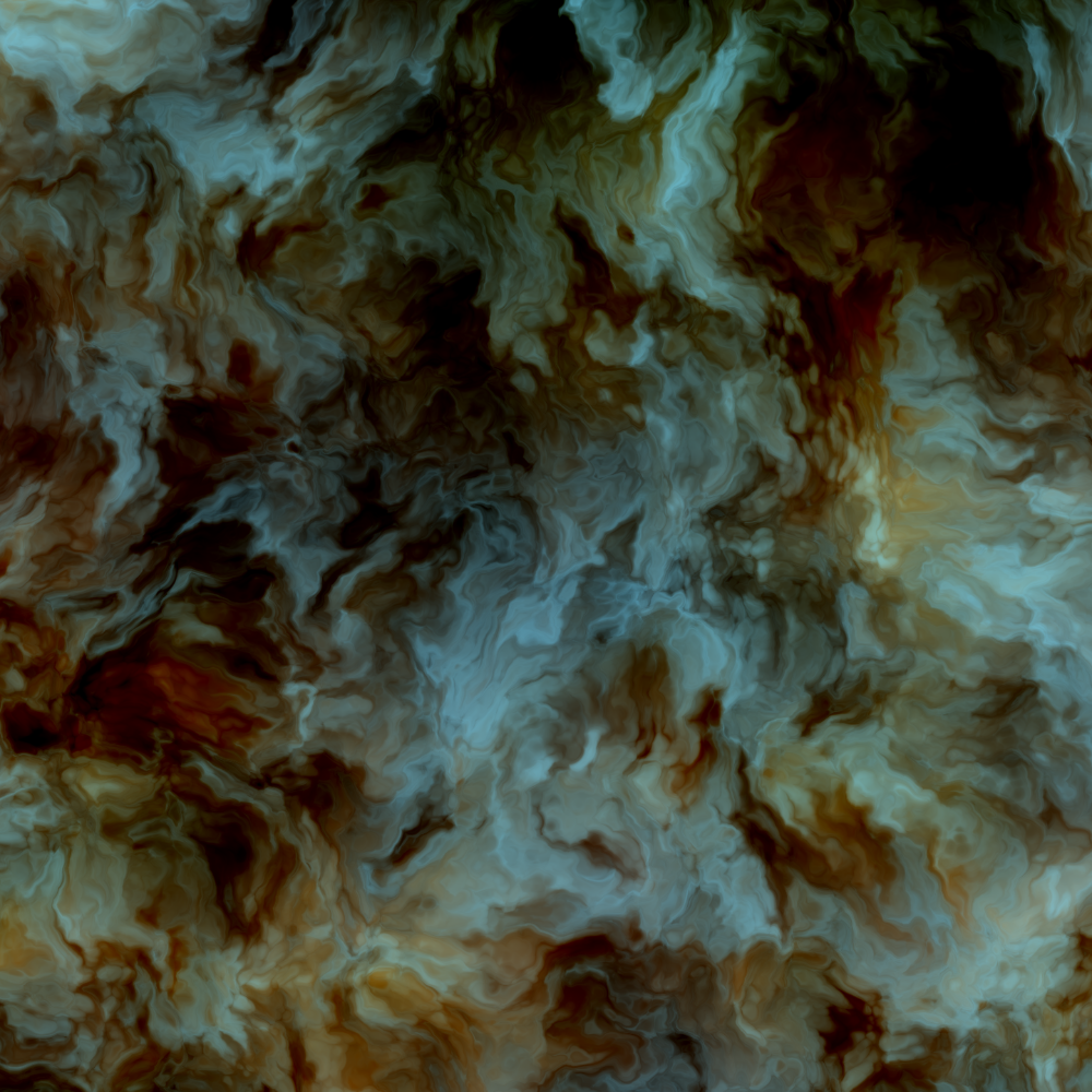
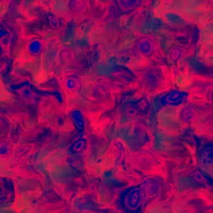
The search for palettes truly began when I accidentally stumbled upon a colour combination that immediately reminded me of some kind of polished wood. That palette made it to the final selection. It is the one named “Flama”, which is featured above. You can also see here on the right a couple other examples of the palette that you may recognize from the final collection.
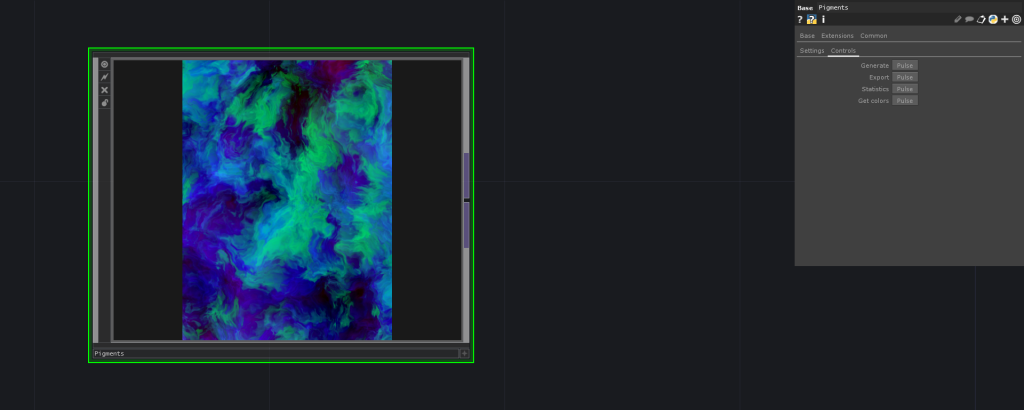
To a large extent, that palette was the result of a blind search. I simply entered some random numbers in the range of black to red to test my idea and was very pleasantly surprised by the outcome. Nonetheless, to explore colour combinations systematically, I created a tool that pulls highly ranked colour palettes from the web and stores them in a small database.
There are various such tools involved in the generation of Pigments. Each of them has a simple interface to switch quickly between parameters and perform adjustments on the fly. A peek into the composition system is shown later in the article, if curious.
Palettes are a complex topic in this project since they are not treated in a standard linear way. They depend on a series of operations which made the selection process lengthy and laborious. Any given palette is comprised of a total of six colours. Here, for example, the colours that make up “Flama”:

The palettes are non-linear in the sense that passing a given colour to the maps does not necessarily result in that colour at any level in the outcome. This is why it was rather impossible for me as a designer to predict what the colour combinations would end up looking like. The cause are the five co-dependent interpolations aforementioned, each of which evaluates a unique value per pixel mapped by the corresponding noise algorithm. Here is a little diagram of the colour flow that may explain this better.
There are in total 109 carefully selected palettes in the final program. No layout has the same palettes, and some of these exist in only a specific one. It is statistically meaningless to assign extraordinary value to a “rare” colour combination in Pigments beyond an aesthetic appreciation since some colours will be scattered by necessity.
The basic arbitrary rule I gave myself in coming up with the number of palettes per layout was that there should always be at least ten. At that rate, there seemed to be enough colour variety for the whole collection. The minimum number of palettes are 11 for the Sinuosity layout, while the maximum is 27 for Oleo. The only exception is Partitions, which deliberately has only a single possible colour palette (Xenoid).
It is worth noting that the defining factor for a colour gamut in this project is the layout, not the individual components of a palette. That is notorious in the fact that the same palette can look very different across layouts. Here is an example of that occurring with Drago, using the Sinuosity, Flame, Vapor and Cells arrangements:
Note that, even though there is an orange-like colour in layouts such as Flame (second) and Vapor (third), that tint is not present in the components of Drago. Here are the individual colours that make that palette:

While designing Pigments, I discarded hundreds of colour combinations. Most palettes would not work visually. I curated a sub-set of colours that worked carefully and listed them in tables using a simple script to count and classify palettes. I tried to form a balanced collection with dark and light components.
I doubted whether to include a black and white palette or not. Partitions, for instance, was going to be only grayscale. I did not end up including any black and white palettes for two reasons. Mainly, I did not think they worked too nicely for any of the layouts. All the contrasting elements and the blendings and juxtaposition of colours disappear in that case.
Secondly, I inferred from the Discord server that grayscales as rare mints had become something of a cliché for Artblocks projects which convinced me to avoid it altogether.
Naming
The names of the palettes are, for the most part, neologisms constructed from a mixture of English, Spanish and Latin. That is not because I am particularly skilful with languages, but because I am lazy when naming things, so that seemed like a middle-ground between efficiency and imagination.
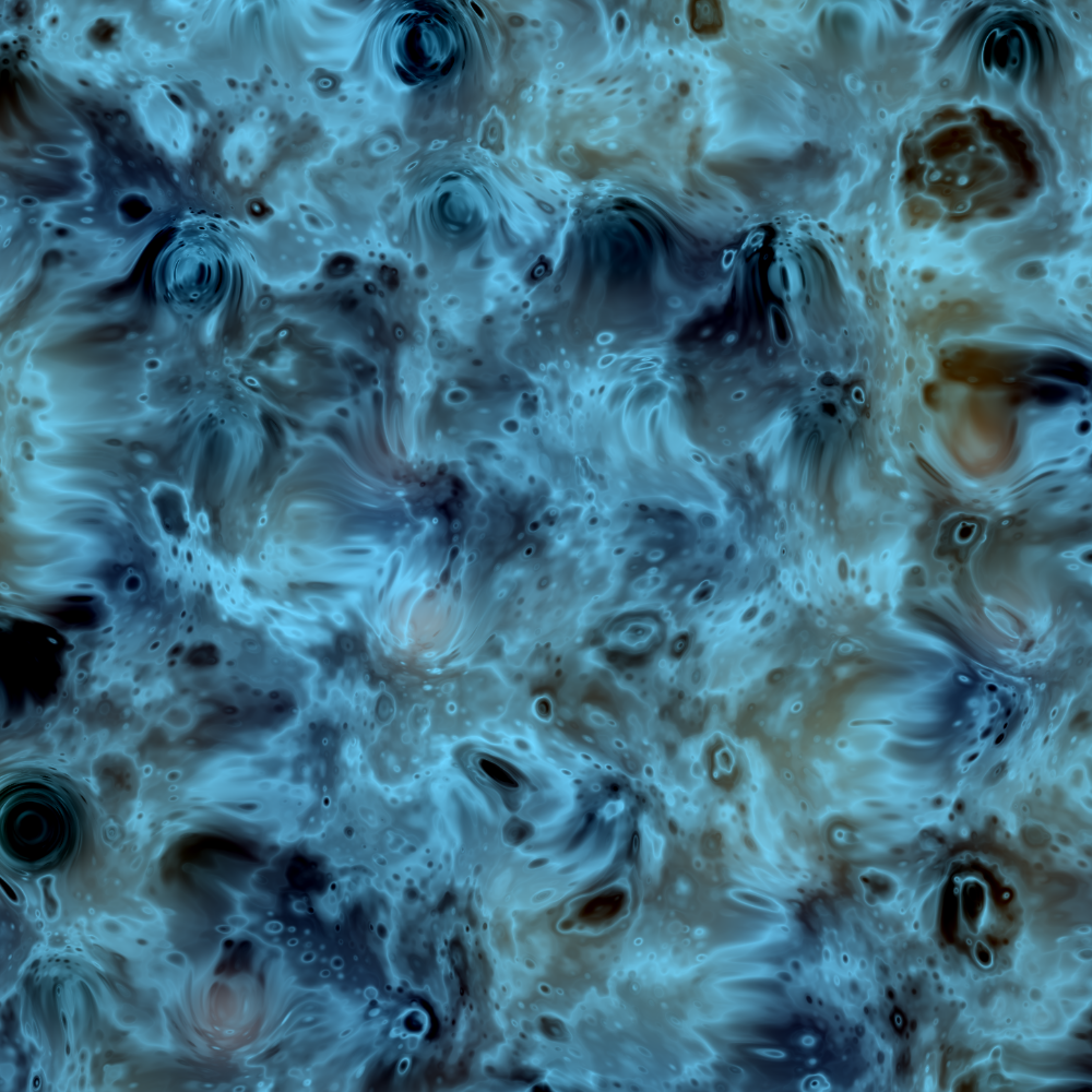
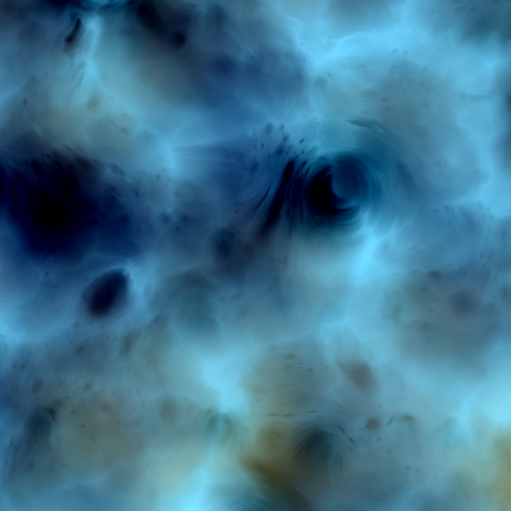
Some of these names are conjunctions of two words, like Oranaz (Orange and Azul ), while others are totally made-up words, like Ixiga. Only a minor subset of all names are actual words, in which case it means that the colour palette created a vivid and concrete image in my head. See, for instance, Tormenta (storm) here on the right. The tones and the colour combinations are like a dramatic scene of a storm at sea. Darkness, wind, foam and furious water flow, giving us a sense of might and danger.
A final curious fact about palettes is that I made a conscious effort to make up at least one name for every single letter in the Latin alphabet. Since I was a child, my family and I play a game called Párame la mano (“Scattergories” in English). The goal is to fill in a word for various categories on a piece of paper as quickly as possible. One of these categories is colour, and I have always been bitter that some letters do not have a colour, at least in Spanish. These neologisms are my way to fix that problem!
Animation
From the very beginning, I designed Pigments to be animated. I wanted to create something like a “moving painting” so the artwork transforms constantly and subtly. I believe that the animated format is the most natural suit for digital generative pieces since it highlights the fact that code can be a living thing, producing infinite output.
You can click here to experience Pigments #0 live.
I am not personally attached to a traditional gallery format, where pieces tend to be more graphic and static. Perhaps part of it is that I have no formal training in visual arts. My personal experience creating computer graphics has always been in the real-time arena where the visuals are computed on the spot and projected at large in screens or buildings.
I certainly hope to see and create more animated pieces, adopting current paradigms in modern multimedia experiences. On this note: for those interested in the technical details, I provide at the very end of this article a little section called Rendering, where I explain how Pigments runs, using programs for the GPU called shaders.
Form
In Pigments, there is absolutely no explicit definition of shapes or forms for the final structures (or layouts). All the resulting configurations emerge purely from the application of domain warping. I want to highlight this fact because it is evidence of the remarkable power of randomness in the context of generative art.
Any visible pattern in the final pieces is 100% the result of noise operations. At times, the results of these simple calculations can be surprisingly organic and natural-looking. That says something about human perception and nature.
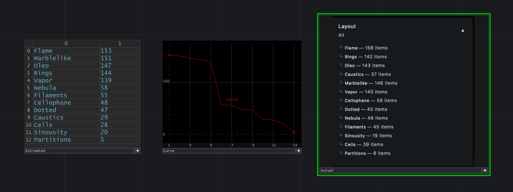
Layouts
The layouts for Pigments were parallel to the research of colour. I began experimenting with this property after I had about ten satisfactory palettes. I tried this in the first place because one of the colour combinations reminded me of a star formation. I wanted to see if I could steer the algorithm to produce something like the Carina nebula.
There are 13 different layouts in total. These are arranged in subgroups, each with a given probability of happening. Consequently, a layout has specific odds within its subgroup, based on how many others populate it. The absolute probability of a layout is a product of all odds.
I briefly describe here all layouts in the order in which they were added to the final program. I also explain the inspiration behind them and their probabilities. More information on why this distribution was chosen after.
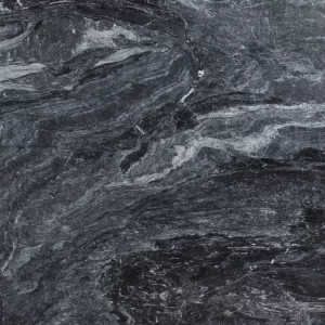
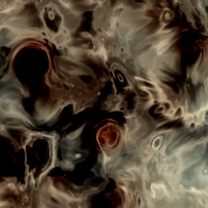
Marblelike
Inspired by the texture of marble. This was the first configuration I found and the one I had to design the least. The initial version had a much higher detail but was progressively trimmed down so that it better resembles natural marble and rocks.
Subgroup probability: 70%
Internal probability: 20%
Absolute probability: 14%
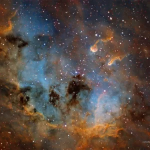
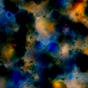
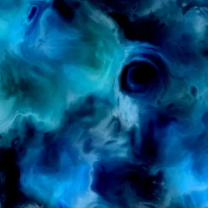
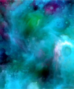
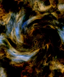
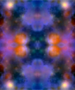
Nebula
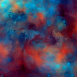
Reminiscent of start formations. Nebula is made of subspaces that have low noise frequency. That results in highly contrasting maps that do not always blend well. For that reason, the layout was difficult to design when it came to the colour palettes. I became convinced of this layout when an astronomer I met said it reminded him of a Nebula. He said that before knowing that it was named like that.
Subgroup probability: 20%
Internal probability: 25%
Absolute probability: 5%
Cellophane
When I was a child, I loved the look and texture of cellophane paper. We used to do many different things with it in school. The smooth details and convex curves in the layout reminded me of it. I particularly like the glossy feel, which in high-resolution makes you think that there are light reflections.
Subgroup probability: 20%
Internal probability: 25%
Absolute probability: 5%
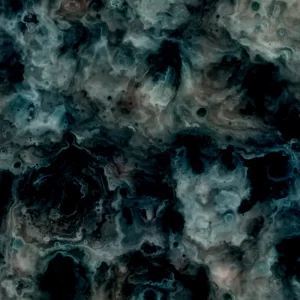
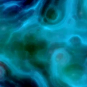
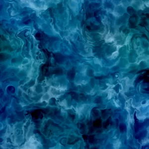
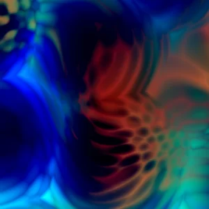
Caustics
I related this layout to the light phenomena of caustics, which is a curvature in the ray of light when it refracts and reflects while crossing some surface or substance. This was inspired by caustics on the water in particular.
Subgroup probability: 7%
Internal probability: 50%
Absolute probability: 3.5%
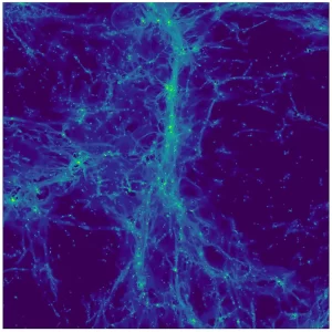
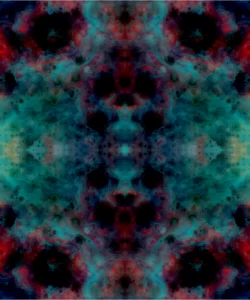
Filaments
Vaguely inspired by “cosmic filaments”, which are the universe’s largest structures. These are formed of galaxies and dark matter and create a network of unfathomable scale. The layout’s thin threads and flow reminded me of an image I had seen on Science News, even though the relation is not explicit.
Subroup probability: 20%
Internal probability: 25%
Absolute probability: 5%
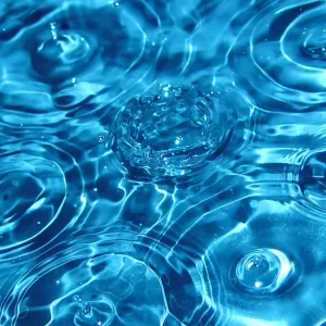
Rings
Named as such because of the threads on the upper layer of the layout. Those reminded me of the rings or ripples formed in disturbed water. Creating it was challenging since I had to fine-tune many parameters to achieve a consistently good looking structure across palettes.
Subgroup probability: 70%
Internal probability: 20%
Absolute probability: 14%
Sinuosity
This layout is one of the most abstract and has no direct correspondence to anything in particular. I named it “sinuosity” because of its visible intricacy in the form of curves and the great detail it has. Sinuosity is a direct cousin of Cellophane. They both originate from the same algorithm.
Subgroup probability: 2.5%
Internal probability: 100%
Absolute probability: 2.5%
Dotted
Dotted also does not have direct inspiration. It was named like that because of the little splatters of dots one can see in some areas of the canvas, which I believe add a nice touch of human-like quality. I particularly enjoy this layout with highly contrasting colours.
Subgroup probability: 20%
Internal probability: 25%
Absolute probability: 5%
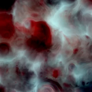
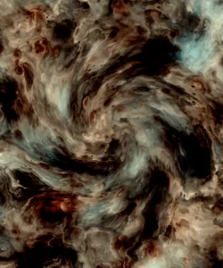
Cells
Called like that because of the recognizable distribution pattern of clusters or packets surrounded by a trail of colour. There is no direct association to something concrete with this layout either. Some palettes made me think of blood cells or some abstract form of a grid.
Subgroup probability: 7%
Internal probability: 50%
Absolute probability: 3.5%
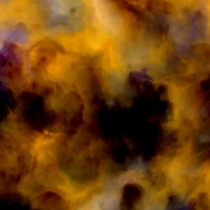
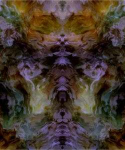
Oleo
Directly inspired by the look of oil paint on canvas. Smooth contours and various densities are formed, which are similar to the strokes and textures of paintings. This was difficult to achieve, given that it required a proper combination of delicacy in the noise factors and a lot of tweaking.
Subgroup probability: 70%
Internal probability: 20%
Absolute probability: 14%
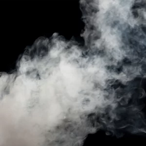
Vapor
Designed to clearly resemble vapour or smoke. Its sharp edges and a strong feeling of depth are a departure from the initial series of algorithms. With Vapor, I used a special type of noise in a configuration that forced me to modify the structure of the whole code. This layout was added in a late stage of the project.
Subgroup probability: 70%
Internal probability: 20%
Absolute probability: 14%
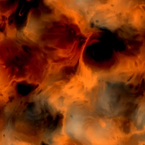
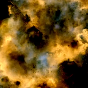
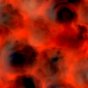
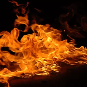
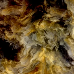
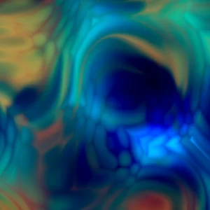
Flame
The most complex layout to make, technically speaking. Like Vapor, it uses a special configuration of noise functions. It is inspired by fire flames and has a very distinct and unique look compared to all the other layouts. I spent an immense amount of time designing palettes for it. Its highly contrasting sub-spaces required special and careful colour treatment.
Subgroup probability: 70%
Internal probability: 20%
Absolute probability: 14%
Partitions
The very last layout I added to the collection. Partitions is very special because it is the only configuration in the series that uses a high “zooming” factor towards the underlying grid. It reveals visible spheres in the underlying structure of the noise algorithm. In some sense, that is like seeing the elementary particles which make all Pigments.
Subgroup probability: 0.5%
Internal probability: 100%
Absolute probability: 0.5%
Distribution
The distribution strategy designed for Pigments is perhaps counterintuitive. I made combinations that I personally consider more beautiful exceedingly common in the hope that as many people as possible will be happy with the piece they got. That is not to say, of course, that I consider rarer pieces necessarily less beautiful. I would not have included them in the collection in the first place if I would. The utility of the probability model I describe is that it filters layouts that cannot support either a large amount of variety or a diverse range of palettes.
From the individual information per layout you can infer that the subgroups are organized as follows:
- Subgroup A: Vapor, Rings, Marblelike, Oleo, Flame
- Subgroup B: Filaments, Cellophane, Dotted, Nebula
- Subgroup C: Cells, Caustics
- Subgroup D: Sinuosity
- Subgroup E: Partitions
I estimated the following distribution, which is very much in accord with the actual outcome of the minting process:
Rarities
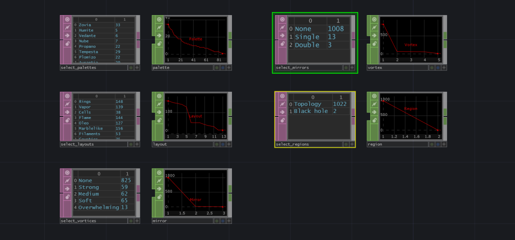
There are some rarities in Pigments, designed with a similar principle as with the distribution of layouts. Rare features in the case of Pigments are tied directly to how experimental I considered a configuration.
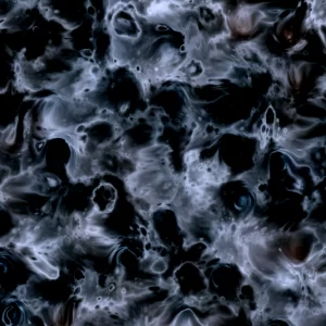
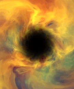
Vortexes, for example, are very organic in some cases, but not all, and sometimes can obfuscate the composition of a canvas by taking too much attention away from the layout and colour. Mirrors create nice symmetries and daunting Rorschach-like configurations but alter drastically the underlying scheme. Black holes have a unique dynamic that can be mesmerizing to look at, especially when animated. All attention goes to the void. However, they are also the most destructive of all features since little of the original patterns are left. Partitions stands on its own as a layout and has none of the disrupting properties of the other rarities, but could not sustain too much formal or colour variety and hence was deliberately limited to a very low probability of happening.
For me, it is much more significant that collectors enjoy the pieces for their aesthetic qualities. Not because they have some arbitrary feature or because they are “rare”. I included rarities in the collection because I think they expand it, featuring experiments in the creative process.
It is certainly fun to search for that low probability mint. Nothing wrong with that. Nonetheless, keep in mind that my intention as a creative coder is to share techniques and art, not merely a product to speculate.
With that being said, let us look more closely at those rarities.
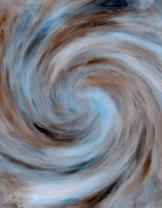
Vortex
A twirl in the centre of the canvas, with variable strength, that warps its surroundings, creating a vortex-like effect. There were 4 possible vortex types in the algorithm: soft, medium, strong and overwhelming. The last type never actually happened since its probability was extremely low.
The idea to include this feature came from trying to model the Nebula layout as a galaxy. I liked the result on other layouts more, so I kept it as an effect.
Only two layouts are allowed to create a vortex, that is due to aesthetic reasons. These are Marblelike and Dotted. The results on other configurations did not feel as organic as with those two. If you are curious to see how some of those look like, see the examples in the “Discarded” section of this article.
The probability of vortices is a function of the likelihood of a Marblelike or a Dotted layout, times the probability set for the rarity.
Layout probability: 14%
Set probability: 20%
Absolute probability: 2.8%
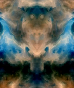
Mirror
Mirrors reflect the canvas coordinates on the x-axis (single) or both the x and y-axis (double).
The feature came from a desire to create an additional layer of symmetry to the otherwise disordered nature of Pigments. This is a very effective visual effect since our brains are wired to find patterns in everything and take great pleasure from things that look symmetric.
As mentioned before, the Rorsach-like quality of this kind of visual makes it very engaging. Everyone finds different patterns by looking at the canvas evolve.
Unlike vortices, mirrors could happen with any layout. Their probability was calculated with a general likelihood of happening times the type of mirror to occur.
General probability: 0.15%
Single probability: 75%
Double probability: 25%
Single absolute probability: 0.1125%
Double absolute probability: 0.0375%
Region
There are two possible regions in Pigments: Topology, which is the standard set of layouts, and Black Hole, which is a black entity in the centre of the canvas that twists everything around it, creating an elliptical distortion of space.
Black holes could only happen with the following four layouts: Nebula, Oleo, Filaments and Vapor. Their probability of occurring is not tied to a compound product, like vortices or mirrors. It is set by a single unique hard-coded factor.
Absolute probability: 0.025%
Composition system
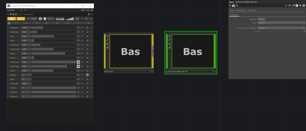
I wanted to give here some brief insights on the composition system devised to generate Pigments. I used the TouchDesigner platform to prototype and control all parameters, which is my software of preference for all real-time work. Below you can see the macro controls used to generate mints locally. You can also see buttons to export helpful data and statistics. This is the macro layer of the whole project.
To control and find interesting configurations, I used a tool of my own called TDMorph. It exposes all parameters assigned to some visual composition and allows for randomization of each parameter at will, using various models. It also facilitates the storage of presets, which is how I found, stored and tweaked all the different layouts and colour palettes.
You can see on the left of the image controls for the main generator and on the right components that define and control colours.
This methodology is how I proceed in my daily work. I first create a generative system that produces computer graphics and later build tools that facilitate their exploration.
To estimate the distributions of the final minting results, I created a script to generate several outputs, along with graphs and tables to inspect the results. This was very handy when designing rarities and probabilities for available types.
Highlights
I highlight here some snapshots of Pigments that I consider particularly beautiful from each layout. I do this only to satisfy the curiosity of people in the community, who were eager to know some of my favourites. I certainly do not expect this to affect your own appreciation of the pieces, which is entirely subjective. So yeah, keep that in mind!
Fun facts
- Pigments are affectionately called “pigs” or “piggies” by the community on Discord and social media, which lends itself to amusing sentences if read out of context, such as Pigs are flying! or I love my piggies!
- There was a bug in the original features script on release that caused confusion about the existence of vortexes. Those were quite tense moments while I was working as fast as possible in fixing the code. Despite years of experience in situations that include live-coding, I have rarely felt so excruciatingly stressed before.
- The core algorithm for Pigments was written in just a couple days, while the design and tweaking of colour palettes took me almost a month. Colour is damn hard!
- The project’s name was originally Toponimy, as in the study of proper names of all kinds. It would have been a shame not to make the shift to Pigments because we would have missed all those sentences with “pigs” on it! 🙂
Showcasing
Many collectors have asked me what is the best way to showcase their Pigments. The answer is that I do not really know, since I am not very familiar with all screen options in the market. What I can say is that you cannot go wrong with a Pantone calibrated OLED display. I used such a display to develop the pieces, so that definitely will give you the most vibrant colours, as I intended them to be. A decent GPU will certainly help to run the code smoothly, but I am not aware of displays with built-in GPUs that can run code natively, but maybe something like that already exists or will be made available in the near future? I hope!
Rendering
This last section is a slight technical digression, targeted at those wishing to know how Pigments is rendered and how it achieves smooth animation in most machines. Feel free to omit this section if you are not interested in technical details.
Before starting, we need at least a basic understanding of parallel computing, shaders and their logic.
Most programs in our computers take place on the Central Processing Unit (CPU). Modern processors are fast enough for us not to notice that a lot of computation is occurring. In general, a CPU can handle processes at very high speeds. But in the context of graphics, operations can be so demanding that visible stutters and lags can happen while rendering. You may see this in heavy computer games or some animated scripts. In the past, as computations for graphical applications became more demanding, a more efficient method of performing these computations was necessary. That is why GPUs and shaders were developed and keep moving forward every year.
A shader is a computer program compiled by the operating system to run directly on the Graphical Processing Unit (GPU). The main difference between a CPU and a GPU is that one computes instructions sequentially and the other parallelly. That results in a drastic speed boost.
To understand this notion, imagine that you have the task of painting a tile on a wall. Let us say that painting this tile takes precisely one minute. Now imagine that someone asks you to paint ten tiles. If you were to do this sequentially, it would take you ten minutes because you can only do one tile at a time.

On the other hand, let us say that the person who hired you hires nine more people for the task. The time to complete the ten tiles suddenly is only one minute, because each worker can paint their tile. By parallelizing the assignment, the required time is nine times less. Do notice that no matter how many people you throw into the task, it will always take at the very least one minute. No two workers can work simultaneously on the same tile.
In this analogy, the tiles are pixels, the workers are the GPU, and the paint is the data we write to each pixel. You may ask if the speed increase is of such magnitude, how come not everything is always running on the GPU? The answer is that not every task is suitable for a parallel program, and not all problems require parallelization. Sequential processing is, in general, sufficient. It is also easier to write since we are so accustomed to thinking serially.
Writing a parallel program takes a different mindset because one writes code meant to produce different results per pixel. In a shader, we need to find ways to draw things differently using only the coordinates of each pixel in the grid. That is usually all the data we have and all the data we need.
There are various types of shaders used at different stages of the rendering pipeline: vertex, geometry, fragment (or pixel), compute and others. Pigments use procedural fragment shaders. Explaining all types goes well beyond the scope of this article. The OpenGL reference is a good resource where you can find basic information.
Hopefully, this explains how Pigments run and why they are relatively smooth, even in low-end laptops and phones.
Acknowledgements
I would like to thank my dear friend Jaap Smit for his help while developing this collection. He provided valuable criticism on the pieces and had long and fruitful discussions with me on ethics, aesthetics and cryptocurrencies.
As beneficiaries of an exploding field, we are suddenly in the position of being able to support and advance causes that are urgent and important. I feel we have the responsibility to help. Not only as artists, developers or collectors but as human beings. A sizable percentage of the proceedings from Pigments were destined to:
- Refugees International, which advocates for human rights and displaced people globally.
- The Charles Darwin Foundation, which conducts scientific research and environmental conservation of the Galapagos Islands.
- InConcerto, which provides free access to classical music in usual locations in Ecuador.
Finally, I would like to express my gratitude to the Artblocks development team and the community in general, whose focus on generative art is unbelievable and inspiring. Thank you!
Explore the project
The most comfortable and intuitive way to browse the whole Pigments collection is Artblocks and perhaps FilterBlocks. Do not forget to click on the pieces to see the live animated version.
To collect Pigments, you may search on the secondary market, via OpenSea.
For information on sales and other statistics about the project, you may go to Artacle.